Projects: Some highlights of work I've done in school and beyond
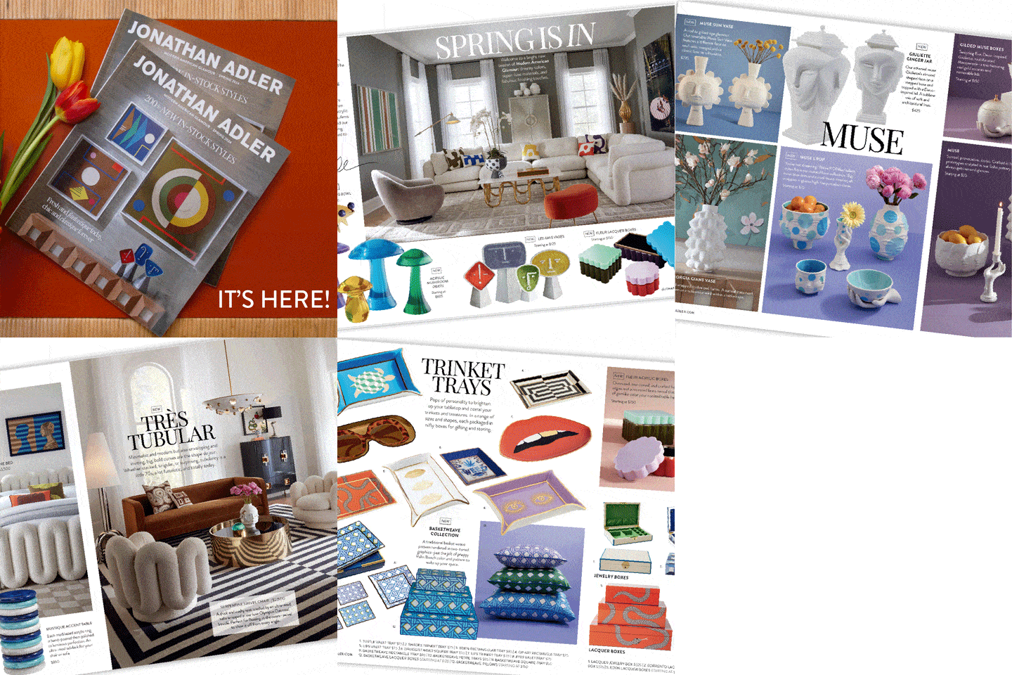
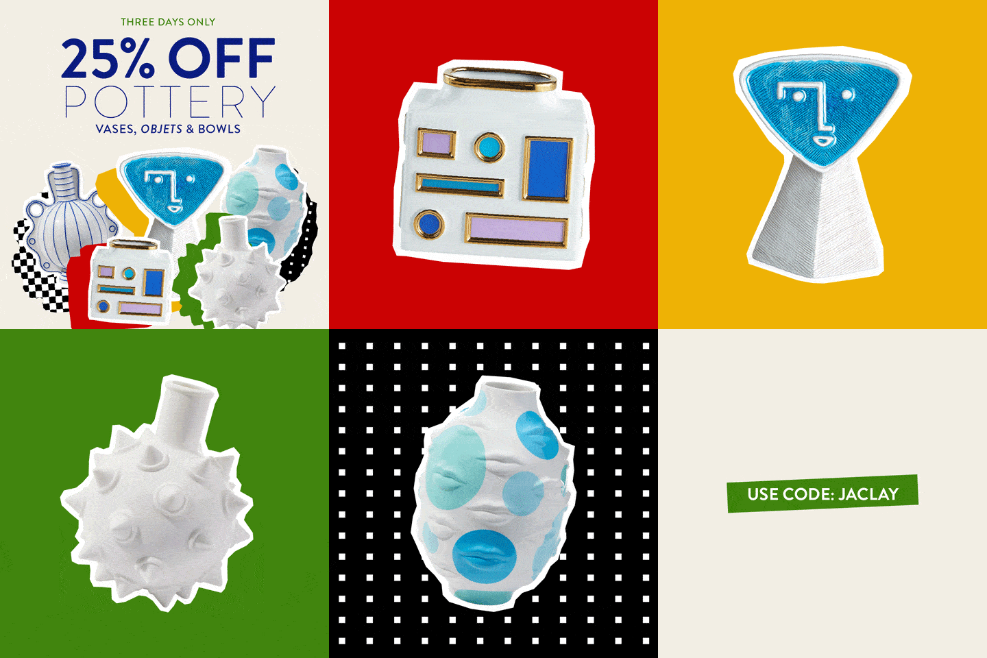
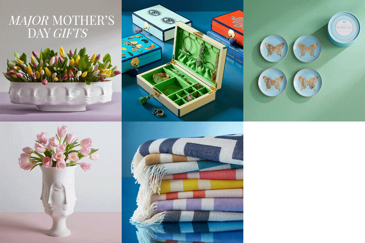
Copywriting & Graphic Design @ Jonathan Adler


GIFS created for SMS promotions


Product Detail Page Copy


Black Friday bundle copy example. Wrote all aspects of the promotion.
Email Copy (Marketing)
These are two examples of email copy that went into production each week.


Graphic design @ AppCard
AppCard is a growing technology startup that provides personalized marketing, digital coupons, and shopper analytics for multi-location retailers, franchises, and independent grocers.

New layout format for their Case Studies.

Instagram designs for AppCard's Independent grocery stores:
Graphic design @ C3NYC


Content Designer & Coordinator
The Foundation United: Global anti-sex trafficking and exploitation nonprofit.
During my time at The Foundation United, I led and initiated improvements of digital elements on their website and Instagram. As well as creating and re-branding print components and curriculums. In addition to coordinating social media improvements with the PR agency.
SPEAK UP Curriculum rebranding: This is one of the ideal projects I got to work on.
SPEAK UP is The Foundation United's turn-key, "train-the-trainer" model that helps prevent sex trafficking, exploitation, and abuse. It is designed for school leaders to efficiently train their teaching and support staff on awareness and prevention efforts to combat these issues. SPEAK UP is a national pilot with Michigan State and Yale for the 2022-2023 school year. The task was to give the curriculum a 2.0 look and feel to match the new and improved content that educators were working on developing. The curriculum leads to equipped and capable teachers bringing this critical information to their students.
On the design side of things: I felt it was essential to prioritize using mono-spaced fonts so that all children and people reading the slides could understand the words, regardless of their learning disorders or other disabilities. I also chose a bright color for each grade group associated with positive feelings and traits. For example, seeing orange increases brain memory; yellow for attention; green for focus; and blue for calm.
SRQ Magazine: Full page highlighting The Foundation United. Featured in their October '22 monthly issue. Wrote, edited, and designed by me.

Journalism + Design Capstone
Fall '21 @ The New School

During the semester, I found direction in telling the stories of different women's experiences living with ADHD. This angle was personal to me. It felt relevant and yet not too medical. I didn't want jargon to get in the way of the experiences. I like to think of these interviews as conversations we had together discussing ADHD and its impact.
I made this zine through a semester-long process. It comprised ten long-form interviews that resulted in combing through the content to form the narrative to organize and design the pages.


The New School Free Press
The highlight of my college career was my time on the Free Press. I spent five semesters on the student-run newspaper. I held various roles, including Arts & Culture Editor, Editor-in-Chief, and Senior Editor. I made friendships, gained invaluable mentors, and wrote and edited some killer stories. But my favorite thing we got to do was work on the monthly print issue. I learned so much in good times and challenges.

This was our first issue in the new magazine layout. Being at such a visual and creative university, it was imperative to cater to how students and faculty would want to receive their news.

This was the second issue in the magazine format. It was very exciting. We found our footing a bit more and chose features from other publications to incorporate into the issue.

It was so much fun to incorporate full spreads and other visually stunning aspects that NSFP had never done in the past.
I am so proud to say that The New School Free Press still follows the magazine format today for any issues they produce.
Fine Art


